Activity in the field of graphic design may seem somewhat contradictory to the idea of Constructivism, which in its principles aimed primarily at creating three-dimensional structures. Artists who engaged in agitational activities associated with the revolution prepared posters and panels with slogans. However, this was only a small fraction of the total activity of the Constructivist movement at that time. Many of the Constructivist concepts were not implemented due to the situation prevailing in the impoverished and war-ravaged Russia. Perhaps that is why relatively inexpensive graphic design became a space where artists could realize their ideas. In the second half of the 1930s, it was a dominant area of activity for many of them [1].
Abstraction and Geometry
A characteristic feature of Constructivism in graphic design was breaking away from historicism and showing the nature of the modern, progressive world. This approach was expressed in the rejection of all ornaments and simplification of the image. The basic plastic means were the use of simple geometric forms creating abstract, often asymmetrical compositions [2].
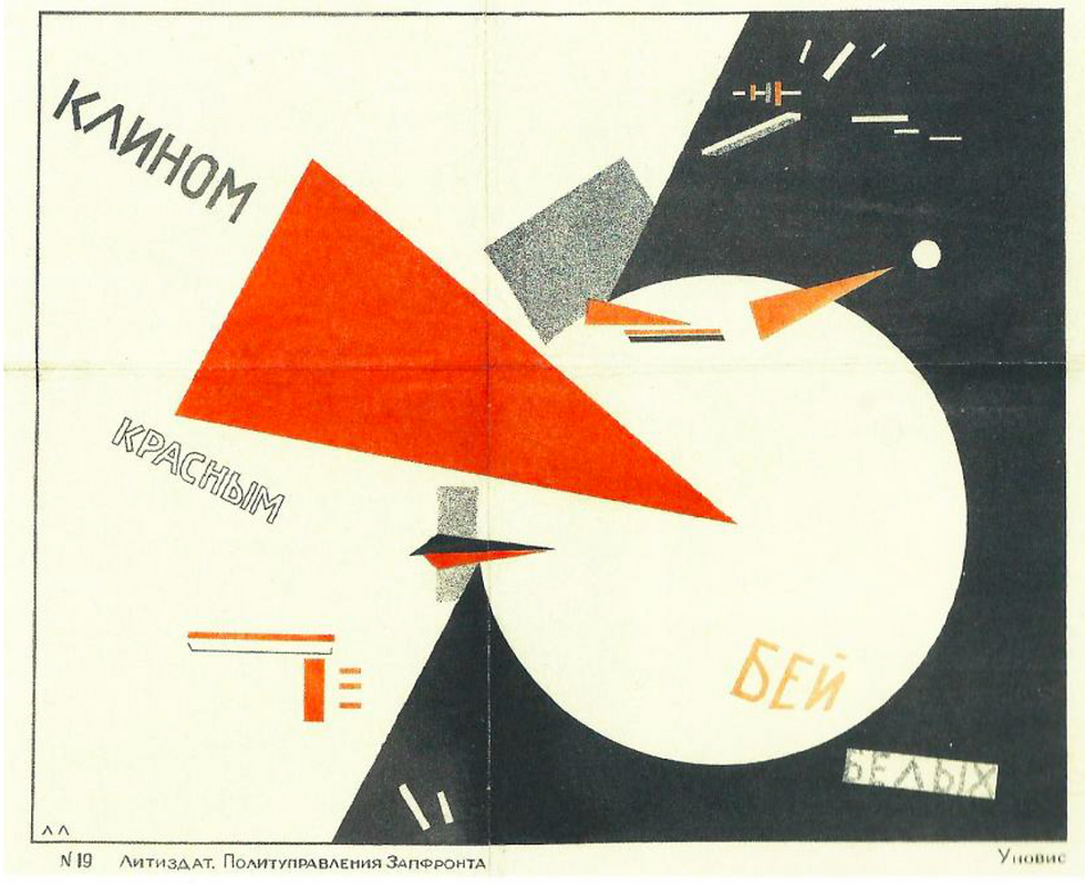
Fig. 1. El Lissitzky, „Beat whites with a red wedge”, 1919
Source: Z. Kolesár, J. Mrowczyk, Historia projektowania graficznego, Kraków, Karakter, 2008, p. 142.
One of the most famous works of this period is the poster "Beat the Whites with the Red Wedge" by El Lissitzky, presented in figure 1. At the center of the work are two large geometric figures. A red triangle is superimposed on a white circle, with a fragment with a sharp angle, suggesting its insertion into the center of the circle. It is also slightly above the circle, dominates it, and additionally pushes it towards the dark plane. There are also other, smaller figures on the poster. The composition evokes the Suprematist works of Kazimir Malevich. Lissitzky attributes ideological-political value to colors and shapes: the red, dynamic triangle symbolizes the Bolsheviks and the revolution; the white, passive form of the circle represents supporters of the old order - the White Army, the tsarist regime, and the church. This work is considered an expression of affirmation of revolutionary events [3].
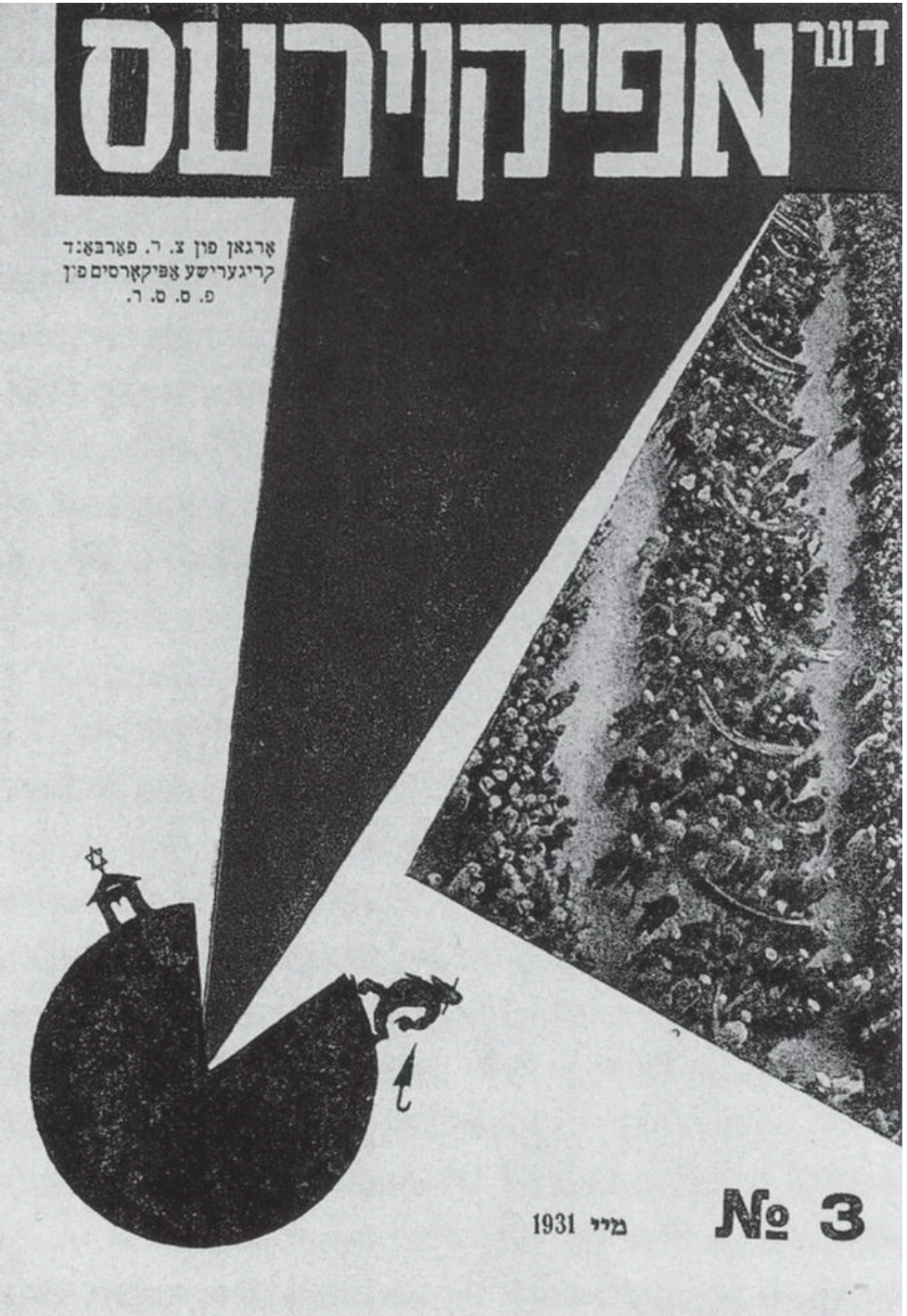
Fig. 2. El Lissitzky, Okładka pisma „Apikojres”, 1931
Source: A. Kamczycki, Czerwonym klinem bij białych: Żydowskie inspiracje El Lissitzky’ego, Studia Europaea Gnesnensia 4, 2011, numer 4, p. 194.
Lissitzky also uses the concept of a wedge driven into a circle in the design of the cover for the magazine "Apikoyres" in 1931 (figure 2). The title of the magazine translates as "Atheist" and it is a statement meaning a Jewish heretic who does not believe in revelation. Such a person will not have a place in the Future World - they will be condemned for eternity. The cover depicts the earth, which is split by a triangle. The polygon decidedly dominates over the circle. Its sharp end separates the space between the synagogue with the Star of David on the roof and the figure of a religious Jew heading towards it. The artist suggests that revolutionary transformation requires sacrifice in the name of a new, better world. In Lissitzky's notes, one can find formulations connecting the coming of the Messiah with the revolution. In his opinion, the idea of establishing universal justice and class equality in post-revolutionary society was a harbinger of redemption and the coming of a utopian world [4].
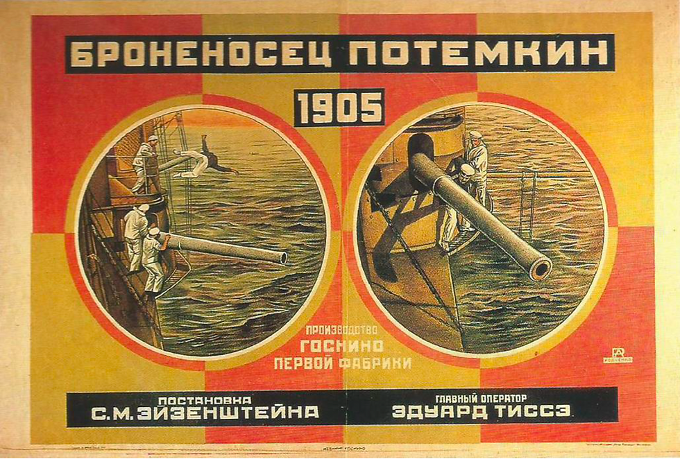
Fig. 3. Aleksander Rodczenko, Poster of the movie „Pancernik Potiomkin”, 1925, 72 × 110 cm, Biblioteka im. Lenina, Moscow
Source: A. Boudier, Życie Konstruktywistów. Aleksander Rodczenko, Wielcy malarze. Ich życie, inspiracje i dzieło, 2001, numer 131, Konstruktywizm rosyjski, p. 9.
Not all Constructivists attributed ideological significance to geometric forms in the way Lissitzky did. Most used shapes to create structure and construct compositions. An example is the poster for Sergei Eisenstein's film "Battleship Potemkin," which was designed by Alexander Rodchenko in 1925 (figure 3). The composition is symmetrical, consisting of two tangent circles containing illustrations. The circles have borders and are arranged on eight rectangles adjacent to each other. All shapes are filled alternately with yellow and red. It can be seen that the composition is constructed according to strictly defined rules [5].
Color Palette
A characteristic feature of Constructivism is the limitation of the color palette to three colors: white, black, and red. The reason for this was to give symbolic meaning to the color red and to associate it with the revolutionary movement [6]. The limitation of the color palette also had other sources.
The color red is associated with Kazimir Malevich's Suprematism. Perhaps, like this artist, the Constructivists also referred to the cultural symbolism of red. In the collective consciousness of Russians, this color signifies beauty. The words "krasnyj" (red) and "krasiwyj" (beautiful) have the same etymological basis [7].
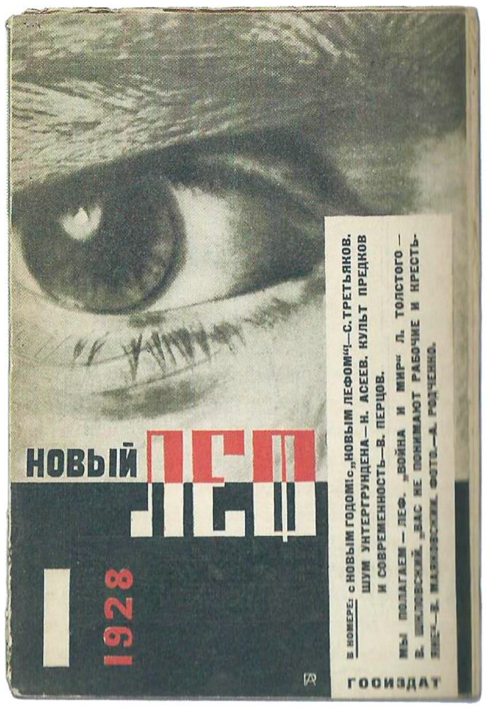
Fig. 4. Aleksander Rodczenko, Magazine cover „Nowyj Lef”, 1928
Source: Z. Kolesár, J. Mrowczyk, Historia projektowania graficznego, Kraków, Karakter, 2008, p. 140.
One of the assumptions of Constructivism was the pursuit of form economy and maximum focus on the function of the object. Artists, when preparing graphic designs, tried to optimize the use of materials needed for their printing. They paid equal attention to both unprinted and printed surfaces. They tried to achieve visually appealing effects using only black ink. Meanwhile, the color red served as a complementary color, adding vividness to their graphics. By using just two colors of ink, prints could be easily and efficiently reproduced, even in small quantities [8]. The creative use of color is well illustrated by the cover of the magazine "Nowyj Lef," designed by Alexander Rodchenko in 1928 (fig. 4). The magazine title is horizontally divided in half. Its upper part is red, while the lower part is an unprinted space, "cut out" from a black plane.
Simple Typography
The characteristic tendency of Constructivism towards objectivization of communication and fascination with civilizational progress had a significant impact on the use of typography. The geometrization and simplification of Cyrillic, manifested in the use of sans-serif typefaces, were intended to facilitate communication with Russian society [9]. Simple typography also aptly captured the essence of the progressive, mechanized world. Typographic forms often had an architectural structure, which gave them a technical and cool character. An additional advantage of using simple typography was the ability to efficiently copy designs [10].

Fig. 5. Lubow Popowa, Cover of the first issue of the magazine „Ku nowym brzegom”, 1923
Source: M. Dabrowski, Liubov Popova, Nowy Jork, The Museum Of Modern Art, 1991, p. 108.
Artists paid great attention to typography. Letters often did not serve only an informational function but became the main compositional elements. A good example is the cover of the music magazine "Ku nowym brzegom," designed by Lyubov Popova (fig. 5). The artist uses simple, bold letters in different sizes and colors to create visual blocks, forming an asymmetrical structure. Through the use of contrasts, she highlights the most important parts of the text [11].
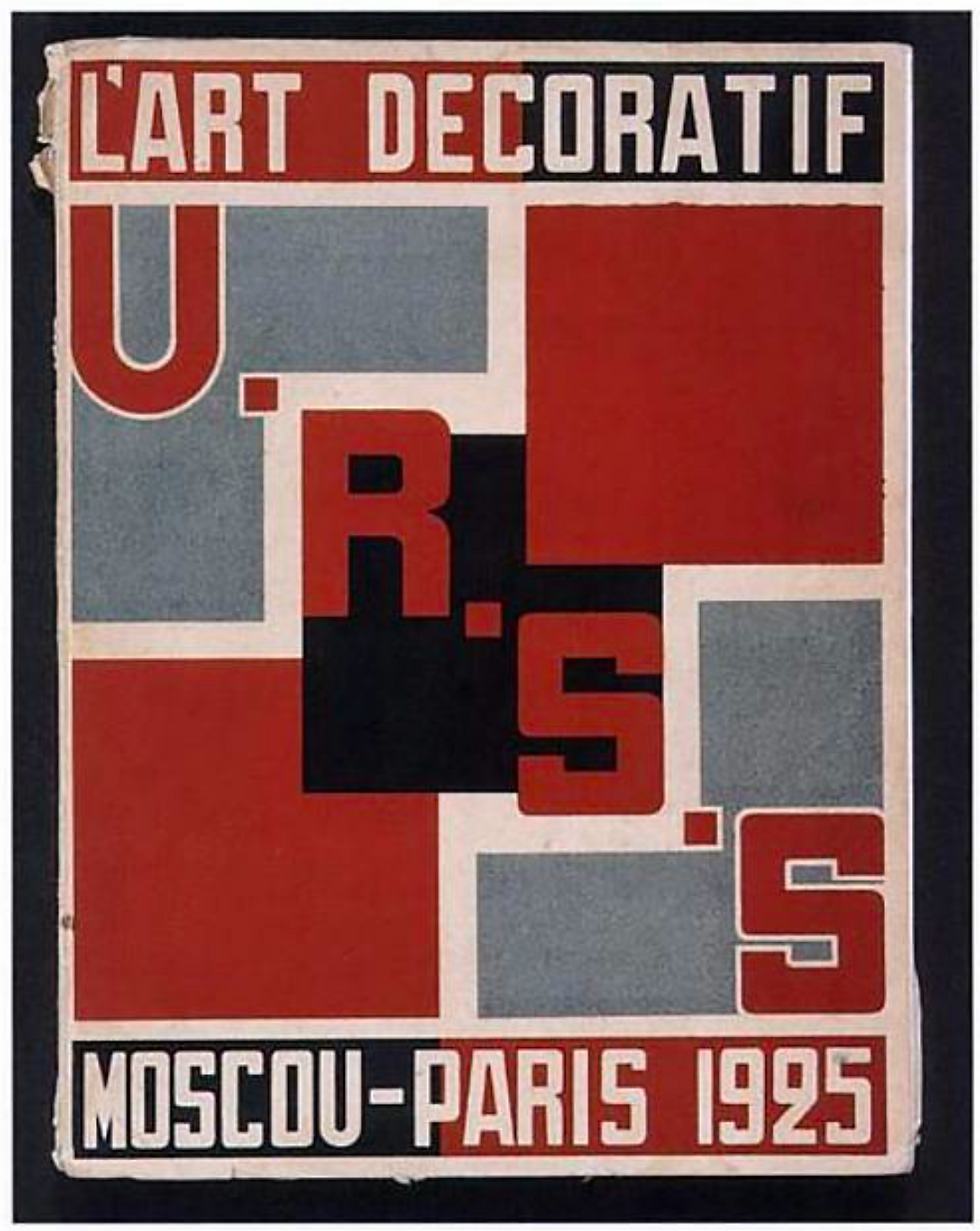
Fig. 6. Aleksander Rodczenko, Poster of the Russian section of the International Exhibition od Contemporary Decorative Art and Design, 1925
Source: D. Raizman, History of Modern Design: Graphics and Products Since the Industrial Revolution, Londyn, Laurence King Publishing, 2003, p. 178.
Artists combined typography with geometric elements. This technique is well illustrated by Alexander Rodchenko's poster for the Russian section of the International Exhibition of Modern Decorative and Industrial Arts held in Paris in 1925 (fig. 6). The poster features two horizontal lines of sans-serif, bold text. Between them is the acronym "USSR" – Union des républiques socialistes soviétiques – Soviet Union. The letters are arranged diagonally, from the upper left corner to the lower right. They dominate over squares that fill the remaining part of the composition. The colors of the individual elements – white, gray, black, and red – are arranged to provide maximum contrast [12].
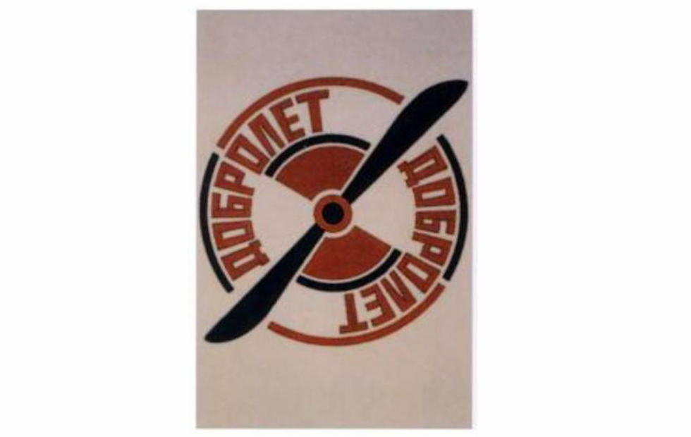
Fig. 7. Aleksander Rodczenko, Szkic logo firmy Dobrolet, 1923 King Publishing, 2003, s. 17
Source: D. Raizman, History of Modern Design: Graphics and Products Since the Industrial Revolution, Londyn, Laurence King Publishing, 2003, p. 179.
Rodchenko often used the contrast of oblique lines with squares or circles to create dynamic compositions. This effect can be seen, for example, in the series of advertisements he created for the aircraft manufacturer Dobrolet. In the logo he designed for this company (fig. 7), he juxtaposes circles intersected obliquely by an airplane propeller. Around the inner edge of the circle, simple sans-serif letters form the company name. Note the edge of the second letter "O" – thanks to the technical typeface, this letter becomes an extension of the perpendicular line to the propeller, dividing the entire sign into quarters. The alternating arrangement of colors further enhances the dynamism of the composition [13].
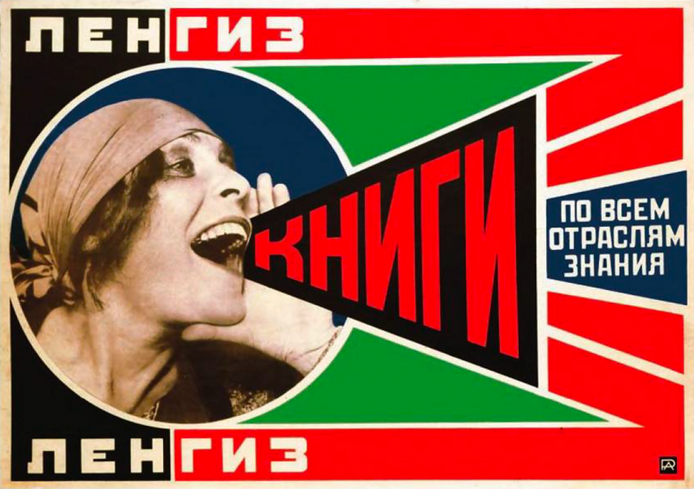
Fig. 8. Aleksander Rodczenko, Company advertising „Gosizdat”, 1924
Source: M. Hillner, Basics Typography 01: Virtual Typography, Lausanne, AVA Publishing, 2009, p. 25.
Rodchenko also creatively used typography on a poster promoting Gosizdat – the State Publishing House of the RSFSR (fig. 8). In the work, a photo of actress Lili Brik, joyfully shouting the word "books," is used. The letters are arranged in a triangle shape, suggesting the sound emanating from the woman's mouth. Despite this distortion, the word is easy to read. The oblique lines contrast strongly with the circle containing the actress's photo, making the entire composition very dynamic [14].

Rys. 9. Aleksiej Gan, Rozkładówka z publikacji „Konstruktywizm”, 1922
Źródło: C. Lodder, Russian Constructivism, New Haven, Londyn, Yale University Press, 1983, s. 182.
Creative use of typography can also be found in various publications. It is worth mentioning the theoretical treatise "Constructivism" written by Aleksei Gan in 1922. The artist used typography to reinforce his message. He divided the text into short phrases, which he placed on spreads at various intervals. Some of them were placed at an angle. Gan used underlines, differentiated text thickness, and letter spacing. He used both sans-serif and serif typefaces, which is not a typical technique for Constructivism, but is now recognized as one of the ways to build contrast in typography. He framed his statement "Art is not alive" with thick black lines. Thanks to all these actions, his publication took on the character of a poster [15]. One of the spreads from Aleksei Gan's manifesto is shown in figure 9.
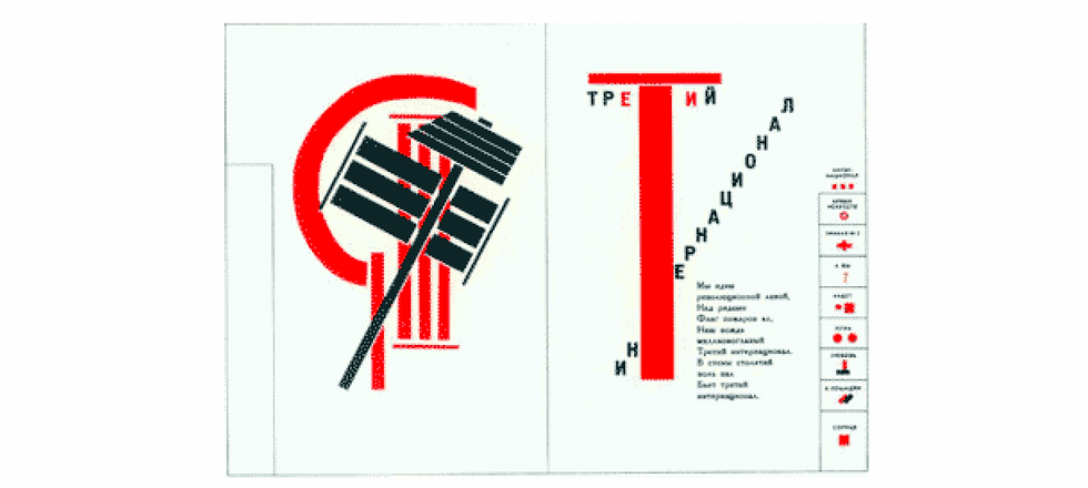
Fig. 10. El Lissitzky, Spread from the publication„Dla gołosa”, 1923
An interesting example of book design can be found in the poetry volume "For the Voice" by Vladimir Mayakovsky, published in 1923. The graphic layer was designed by El Lissitzky. The artist constructed illustrations using letters, whole words, and punctuation marks. This made the words not only audible but also visible, as he himself wrote [16]. In addition to transforming text into illustrations, Lissitzky applied another unusual solution. On the right side of the book, he placed an index that allowed for quick location of poems. This method, typical of solutions used in address books, was an expression of the Constructivists' pursuit of maximal functionality of objects and an expression of the industrialization of art [17]. Figure 10 presents a spread from the poetry volume "For the Voice."
Photography and Photomontage
The utilitarian idea of Constructivist art manifested in artists moving away from easel painting and exploring new areas of creativity, such as graphic design. Geometric and typographic forms were initially complemented by synthetic drawings. In the mid-1920s, hand-drawn illustrations were increasingly replaced by photographs [18].
Photography fit very well with the idea of Constructivism because it combined the modern world of machines, technology, and industry with the world of art. An image produced by a mechanical device could be reproduced infinitely. In this way, each photograph had an individual character but was simultaneously devoid of a certain mysticism associated with the uniqueness of a work of art. One could say that taking photographs was a form of mass art production [19].
By incorporating photographic elements, graphic designs gained an additional value of truth that drawings did not provide. However, it was a partial truth because the photos were cut out and arranged in new layouts [20].
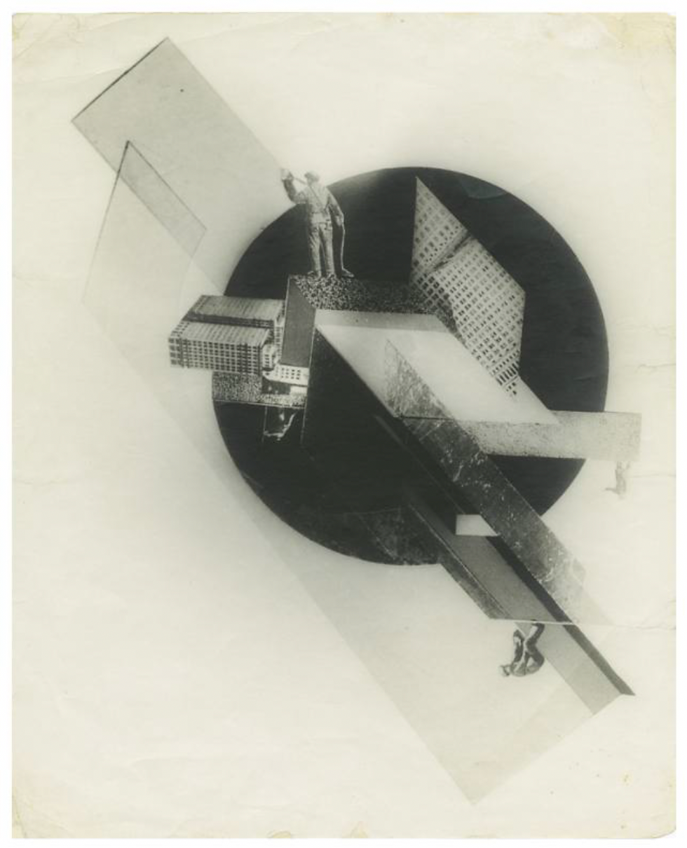
Fig. 11. Gustaw Klutsis, Dynamic city, 1919
Source: M. Tupitsyn. Colorless Field: Notes on the Paths of Modern Photography. W: M. Abbaspour, L.A. Daffner, M.M. Hambourg, eds., Object:Photo. Modern Photographs: The Thomas Walther Collection 1909–1949, Nowy Jork, projekt internetowy Museum of Modern Art, 2014, p. 2 http://www.moma.org/interactives/objectphoto/assets/essays/Tupitsyn.pdf

Fig. 12. Gustaw Klutsis, Dynamiczne miasto, 1919-1920, oil, cement and sand on wood, 87x63,5 cm
One of the pioneers of photomontage was Gustav Klutsis. His work "Dynamic City" (fig. 11) from 1919 is compositionally similar to the painting by the same title, dating from 1919-1920 (fig. 12). Both works feature rectangular solids grouped along a diagonal axis. In the background of the composition is a circle. In the photomontage, the artist uses photos of American skyscrapers. Some rectangles also have the texture of building surfaces. Klutsis also includes photos of workers at the ends of the structures. The figures are oriented with their feet towards the center of the circle, suggesting that this dynamic city is an independent microcosm with its own center of gravity. Photography in this work is a representation of existing reality. Through its use, the abstract composition composed of geometric figures gains a reference to real life [21].
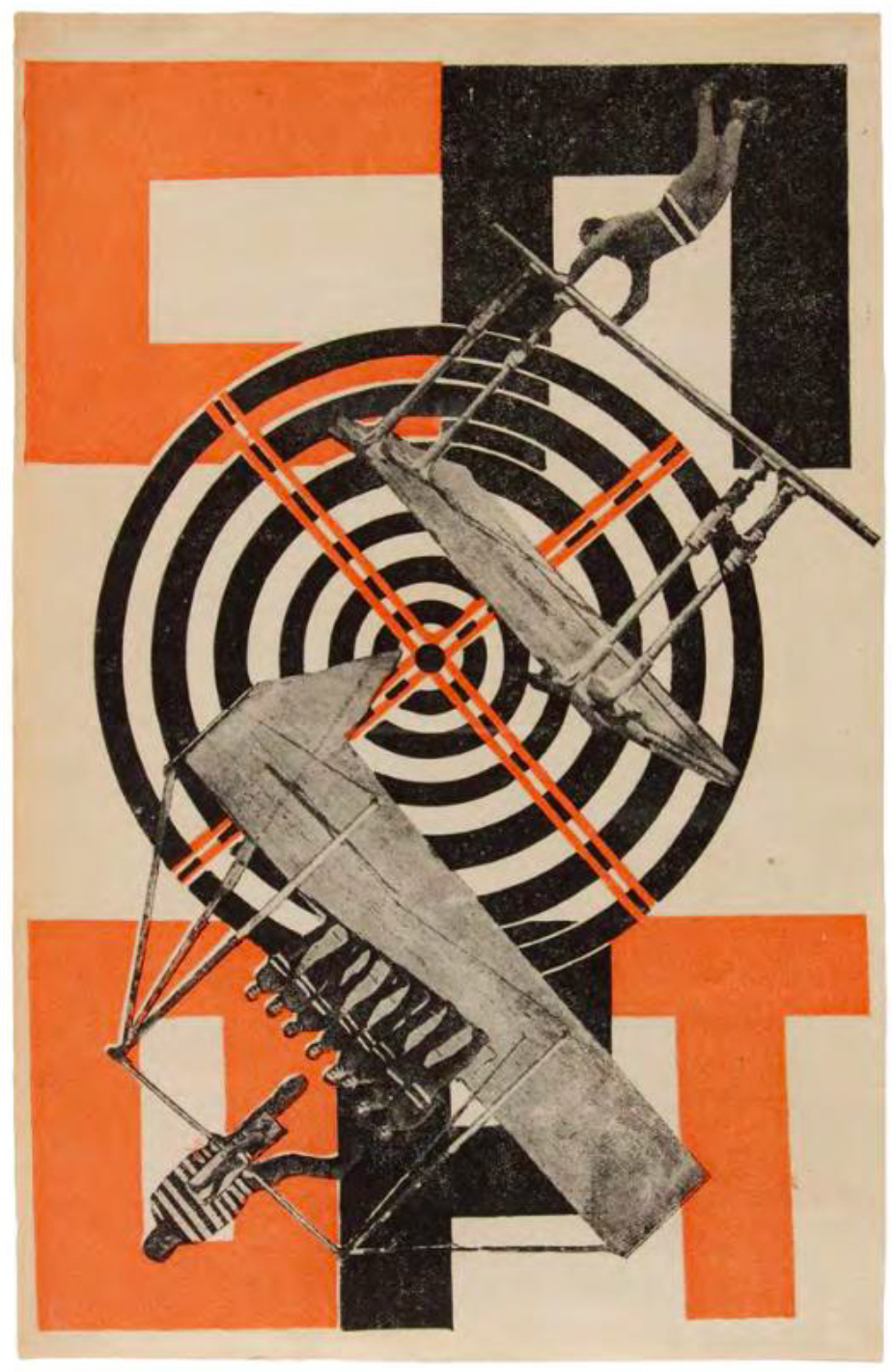
Fig. 13. Gustaw Klutsis, Sport, 1922, litograph on paper, 22,2x12,7 cm
Source: J. Jensen, A. Sudhalter, Gustav Klutsis: Works from The Merill C. Berman Collection, Merrill C. Berman Collection, Nowy Jork, 2017, p. 17.
In his works, Klutsis often used diagonal compositions. Another photomontage example resembling "Dynamic City" is the work "Sport" (fig. 13) from 1922. In the center of the work are several circles onto which fragments of photographs of people doing gymnastics are superimposed. The figures are arranged diagonally, adding dynamism to the work and setting the entire composition in rotary motion. In the background are massive, sans-serif letters forming the word "Sport." The color palette is limited to white, black, and red [22].
Photomontage quickly became a commonly used illustrative technique. Artists used it in designing posters, brochures, leaflets. It was also present in books and numerous magazines being published at the time, such as the photographic and film review "Kino-fot" edited by Aleksei Gan, or the aforementioned periodical Lef published from 1923 to 1925, which was reissued in 1927 under the name Nowyj Lef [23].
In 1923, the love poem "Pro eto" by Vladimir Mayakovsky, inspired by the poet's relationship with actress Lily Brik, was published. Illustrations for this publication were prepared by Alexander Rodchenko. He used photographs of the couple, which he combined with cutouts from German and French illustrated magazines [24].
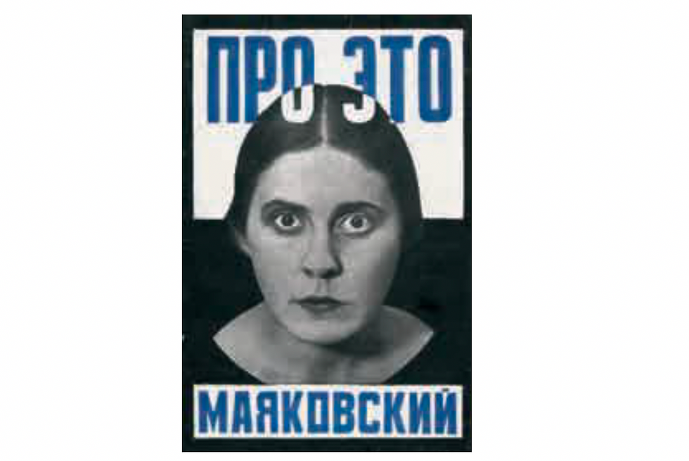
Fig. 14. Aleksander Rodczenko, Cover design for the publication „Pro eto”, 1923
Source: R. Hargreaves, Alexander Rodchenko: Cut and Hammered, Photoworks, 2008, numer 10, p. 32.
The cover of the publication (fig. 14) features a photo of Lily Brik with wide-open eyes and clenched lips. The photograph was commissioned to Abram Sterenberg, another collaborator in this joint production. The composition is complemented by simple, blue, sans-serif letters.

Fig. 15. Aleksander Rodczenko, Photomontage from the publication „Pro eto”, 1923
Source: C. Lodder. Revolutionary Photography. W: M. Abbaspour, L.A. Daffner, M.M. Hambourg, eds., Object:Photo. Modern Photographs: The Thomas Walther Collection 1909–1949, Nowy Jork, projekt internetowy Museum of Modern Art, 2014, p. 12 http://www.moma.org/interactives/objectphoto/assets/essays/Lodder.pdf.
An example of a photomontage illustrating the publication is presented in figure 15. In the upper right corner, Rodchenko placed Majakovsky making a phone call. Diagonally, telephone wires are placed, stretching along American skyscrapers, with the numbers 67-10 – Lily Brik's phone number – written on them. Unfortunately, the phone is being answered by a bored housewife, who is placed in the lower left corner [25].
Avant-garde artists not only used photographs as components of photomontages but also developed the art of photography itself. However, they approached it differently than trained photographers. They experimented with the selection of camera parameters and also sought interesting image construction solutions [26].

Fig. 16. Aleksander Rodczenko, Diving, 1934
Source: C. Lodder. Revolutionary Photography. W: M. Abbaspour, L.A. Daffner, M.M. Hambourg, eds., Object:Photo. Modern Photographs: The Thomas Walther Collection 1909–1949, Nowy Jork, projekt internetowy Museum of Modern Art, 2014, p. 1 http://www.moma.org/interactives/objectphoto/assets/essays/Lodder.pdf
Alexander Rodchenko embodied such an approach, gradually moving away from photomontage in favor of developing photography. The artist began taking photographs in 1924. In his works, he sought unconventional ways to depict everyday situations. He believed that an artist has the ability to perceive visual impressions simultaneously from all sides, and it is his duty to discover and convey new aspects of reality through art [27].
Rodchenko's photography was certainly influenced by his earlier experience in Constructivist activity. He arranged the components of photographs like abstract elements on a two-dimensional plane, achieved through perspective shortening. Photos taken at unusual angles had distorted spatial relationships between individual fragments, making them difficult to read. The artist compelled viewers to spend more time contemplating and reflecting on his work. An example can be seen in the photo of a diver (fig. 16). Rodchenko photographed the figure from below, against the sky, reducing its silhouette to a circular color spot. He also used an asymmetrical composition typical of Constructivists [28].

Fig. 17. Dziga Wiertow, Untitled, 1927-1928
Source: C. Lodder. Revolutionary Photography. W: M. Abbaspour, L.A. Daffner, M.M. Hambourg, eds., Object:Photo. Modern Photographs: The Thomas Walther Collection 1909–1949, Nowy Jork, projekt internetowy Museum of Modern Art, 2014, p. 4 http://www.moma.org/interactives/objectphoto/assets/essays/Lodder.pdf
Dziga Vertov applied similar image creation techniques during the filming of the Kino-Pravda newsreels. Vertov paid great attention to the composition of each frame, as evidenced by the photograph from 1927 or 1928 presented in Figure 17. Interestingly, the photo was actually taken by the artist's brother and cinematographer Mikhail Kaufman. The photo was taken from a frog's-eye view, emphasizing the monumentality of the chimneys. Electric cables add an even more industrial character. They are arranged diagonally and intersect at right angles with the heavier forms of the chimneys, increasing the dynamism of the composition [29].

Fig. 18. El Lissitzky, Kurt Schwitters, 1924
Source: C. Lodder, Revolutionary Photography, W: M. Abbaspour, L.A. Daffner, M.M. Hambourg, eds., Object:Photo. Modern Photographs: The Thomas Walther Collection 1909–1949, Nowy Jork, projekt internetowy Museum of Modern Art, 2014, p. 5 http://www.moma.org/interactives/objectphoto/assets/essays/Lodder.pdf
El Lissitzky approached photography and photomontage in a completely different way. His works are often referred to as photographic painting. The artist worked on photographs not only at the time of their capture but also during development in the darkroom. He achieved interesting effects by combining photo fragments and layering them. An example is the portrait of Kurt Schwitters presented in Figure 18.
The composition consists of two images of the artist in different scales. The first image depicts Schwitters against the backdrop of the word "Merz." His mouth is shown in different positions, indicating that he was speaking during the photo shoot. Additionally, a parrot is placed on his lips. This is a visual reference to the irrational verbal expressions characteristic of Dadaist performances. The second image contains a fragment from "Merz" magazine, on which the artists collaborated. Thus, this portrait not only depicts Schwitters as a Dadaist but also refers to his brief cooperation with Lissitzky [30].
Lissitzky's self-portrait commonly known as "Constructor" (Fig. 19) was created by layering several exposures. The work depicts the act of seeing and creating. Lissitzky's hand holding a compass is superimposed on a shot of his face. The most prominent element is the eye, which perceives reality.
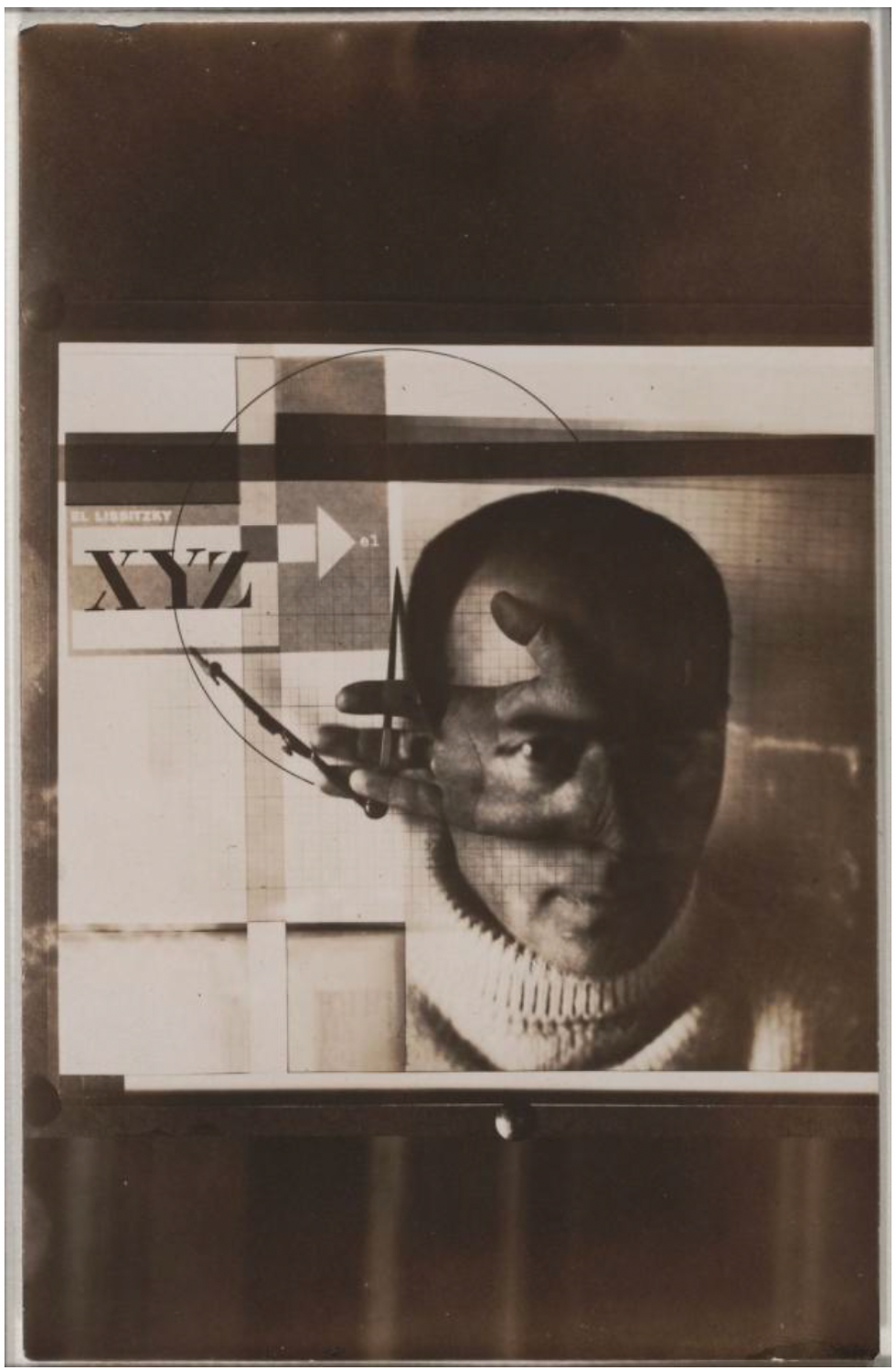
Rys. 19. El Lissitzky, Autoportret: Konstruktor, 1924
Next, the effect of this perception is transmitted to the artist's hand and further to the production tool – the compass. [31]. The image also includes the letters XYZ, graph paper, the artist's letterhead, and a drawn circle. This juxtaposition portrays Lissitzky as a photographer, typographer, and constructor. Proportional sizes and traditional perspective relationships are not preserved in this work. The artist arranges elements according to their significance to the subject. Overlaying multiple exposures allows for the integration of different viewpoints and themes within a single image [32].
SUMMARY
The author has identified the most characteristic visual techniques used by the creators: abstraction and geometry, a limited color palette, simple typography. These techniques were presented with examples that were analyzed. The connection of these visual techniques with the principles of Constructivism was demonstrated. Photography and photomontage were described as new techniques that fit well with the theory of this movement.
Article Author
Szymon Grochowski, MA
Graduate of WIT Akademy
BIBLIOGRAFIA
[1] C. Lodder, Russian Constructivism, New Haven, Londyn, Yale University Press, 1983, p. 181.
[2] Z. Kolesár, J. Mrowczyk, Historia projektowania graficznego, Kraków, Karakter, 2018, p. 138.
[3] A. Kamczycki, Czerwonym klinem bij Białych: Żydowskie inspiracje El Lissitzky’ego, Studia Europaea Gnesnensia 4, 2011, numer 4, pp. 192-193.
[4] A. Kamczycki, Czerwonym Klinem Bij Białych. Rewolucyjno-Mesjanistyczne Znaczenia Dzieła El Lissitzky’ego, Sztuka i Dokumentacja, 2018, numer 19, p. 17.
[5] A. Boudier, Życie konstruktywistów. Aleksander Rodczenko, Wielcy malarze. Ich życie, inspiracje i dzieło, 2001, numer 131 Konstruktywizm rosyjski, p. 9.
[6] A. Kamczycki, Czerwonym klinem bij Białych: Żydowskie inspiracje El Lissitzky’ego, Studia Europaea Gnesnensia 4, 2011, numer 4, pp. 192-193.
[7] A. Boudier, Kazimierz Malewicz, Wielcy malarze. Ich życie, inspiracje i dzieło, 2000, numer 100, p. 16.
[8] Z. Kolesár, J. Mrowczyk, Historia projektowania graficznego, Kraków, Karakter, 2018, pp. 138-140.
[9] M. Hillner, Basics Typography 01: Virtual Typography, Lausanne, AVA Publishing, 2009, p. 24.
[10] Z. Kolesár, J. Mrowczyk, Historia projektowania graficznego, Kraków, Karakter, 2018, pp. 138-140.
[11] M. Dabrowski, Liubov Popova, Nowy Jork, The Museum Of Modern Art, 1991, pp. 25-26.
[12] D. Raizman, History of Modern Design: Graphics and Products Since the Industrial Revolution, Londyn, Laurence King Publishing, 2003, pp. 179.
[13] Tamże, p. 179.
[14] M. Hillner, Basics Typography 01: Virtual Typography, Lausanne, AVA Publishing, 2009, p. 25.
[15] C. Lodder, Russian Constructivism, New Haven, Londyn, Yale University Press, 1983, p. 183.
[16] http://www.designhistory.org/Avant_Garde_pages/Russia.html Strona poświęcona historii projektowania graficznego.
[17] Z. Kolesár, J. Mrowczyk, Historia projektowania graficznego, Kraków, Karakter, 2018, p. 144.
[18] Tamże, p. 140.
[19] C. Lodder, Russian Constructivism, New Haven, Londyn, Yale University Press, 1983, p. 186.
[20] A. Boudier, Konstruktywizm rosyjski, Wielcy malarze. Ich życie, inspiracje i dzieło, 2001, numer 131 Konstruktywizm rosyjski, s. 3.
[21] C. Lodder, Russian Constructivism, New Haven, Londyn, Yale University Press, 1983, pp. 187-188.
[22] Tamże, pp. 190-191.
[23] A. Boudier, Konstruktywizm rosyjski, Wielcy malarze. Ich życie, inspiracje i dzieło, 2001, numer 131 Konstruktywizm rosyjski, p. 6.
[24] R. Hargreaves, Alexander Rodchenko: Cut and Hammered, Photoworks, 2008, numer 10, p. 30.
[25] C. Lodder, Russian Constructivism, New Haven, Londyn, Yale University Press, 1983, p. 199.
[26] C. Lodder. Revolutionary Photography. W: M. Abbaspour, L.A. Daffner, M.M. Hambourg, eds., Object:Photo. Modern Photographs: The Thomas Walther Collection 1909–1949, Nowy Jork, projekt internetowy Museum of Modern Art, 2014, p. 12. http://www.moma.org/interactives/objectphoto/assets/essays/Lodder.pdf.
[27] C. Lodder, Russian Constructivism, New Haven, Londyn, Yale University Press, 1983, p. 202.
[28] C. Lodder. Revolutionary Photography. W: M. Abbaspour, L.A. Daffner, M.M. Hambourg, eds., Object:Photo. Modern Photographs: The Thomas Walther Collection 1909–1949, Nowy Jork, projekt internetowy Museum of Modern Art, 2014, p. 2-3. http://www.moma.org/interactives/objectphoto/assets/essays/Lodder.pdf.
[29] C. Lodder. Revolutionary Photography. W: M. Abbaspour, L.A. Daffner, M.M. Hambourg, eds., Object:Photo. Modern Photographs: The Thomas Walther Collection 1909–1949, Nowy Jork, projekt internetowy Museum of Modern Art, 2014, p. 3-4. http://www.moma.org/interactives/objectphoto/assets/essays/Lodder.pdf.
[30] C. Lodder. Revolutionary Photography. W: M. Abbaspour, L.A. Daffner, M.M. Hambourg, eds., Object:Photo. Modern Photographs: The Thomas Walther Collection 1909–1949, Nowy Jork, projekt internetowy Museum of Modern Art, 2014, p. 5 http://www.moma.org/interactives/objectphoto/assets/essays/Lodder.pdf.
[31] https://www.moma.org/collection/works/83836 Strona internetowa poświęcona pracy Autoportret: Konstruktor El Lissitzky’ego.
[32] C. Lodder, Russian Constructivism, New Haven, Londyn, Yale University Press, 1983, p. 191.
Commentaires